
5 Best Tools For Creating Website Structure – Includes Pros, Cons, and Feature List
Picking the right digital design site mapping tool from a long list of options can be quite a challenge. With so many tools on the market, each offering its own set of features and capabilities, making the best choice can feel overwhelming. In this article, we will help you navigate through this decision-making process by exploring and comparing some of the top digital design site mapping tools available.
Top 5 Tools For Creating Website Structure
Whether you are performing a site audit, looking to improve SEO with better site structure, or are starting to lay out the content for a new website one page at a time, what you need are not bricks and mortar but the best tools for website creation that help you conceive, plan, and visualize your website’s structure with ease.
Our top picks are Lucidchart, Octopus, Figma, Miro, and FlowMapp. These tools are the secret weapons behind some of the best-organized websites you’ve seen on the internet, and it’s time to bring you into the fold.
What Makes A Great Website Structuring Tool?
Understanding what makes a great website structuring tool can be as crucial as knowing the best tools available. Here’s a look at some of the key features that make a website structuring tool stand out from the rest:
- Versatility and Flexibility – It should offer a wide range of design options and allow you to customize structures to fit your specific needs. From simple blogs to complex e-commerce platforms, the tool should handle all with ease.
- Integration Capabilities – It should integrate smoothly with other software and platforms you’re using, such as content management systems, project management tools, or user testing platforms. This makes your workflow more efficient and streamlined.
- Scalability – As your website grows, your needs will change, and so will the complexity of your site’s structure. Therefore, it should be able to adapt and scale with your growing needs.
- Cost-effectiveness – While it’s crucial to invest in a reliable option, it’s also essential that it offers good value for money. A great website structuring tool will offer robust functionality at a reasonable price point.
- Sitemap Creation – It should allow you to easily create and edit sitemaps, helping you visualize how different pages connect and flow together.
- Drag-and-Drop Functionality – This feature makes it significantly easier to add, remove, and rearrange elements within your website structure.
- User Flow Diagrams – The ability to create user flow diagrams can help you better understand and plan the user’s journey through your website, ensuring a seamless and intuitive experience.
What Are The 5 Best Website Structuring Tools
Now that we’ve explored what makes a great website structuring tool, it’s time to step into the spotlight and introduce the stars of today’s show.
There are many options that promise to make your website structuring a breeze, but not all are created equal. Amidst the various products on the market, we’ve identified five tools that truly stand out – Lucidchart, Octopus, Figma, Miro, and FlowMapp.
1. Lucidchart
Charting Your Website Success – With Lucidchart, collaborate and create compelling website architectures from any corner of the world.
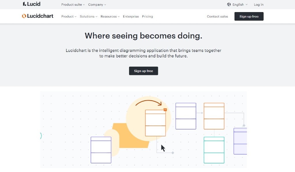
Let’s kick off with Lucidchart. A renowned name in the world of web design, Lucidchart is a comprehensive platform designed to make your digital brainstorming sessions fruitful and efficient, regardless of where you are in the world.
Lucidchart’s strength lies in its user-friendly, intuitive interface. It’s like having a digital whiteboard where you can visualize, refine, and share your ideas seamlessly. Whether you’re sketching a sitemap, planning user flows, or designing wireframes. Plus, with Lucidchart’s library of pre-designed templates and shapes, you don’t have to start from scratch.
Features
- Pre-Designed Templates
- Data Import/Export
- Interactive Elements
- Drag & Drop Interface
- Design in Layers
- Offline Mode
- Email and Link Sharing
- Publish (without password)
Pros
- Lucidchart’s Official Community is a bustling hub of information where answers to your queries are readily available.
- Begin new projects or integrate existing visuals within platforms where you already converse, such as Google Workspace, Atlassian, Microsoft Office, Asana, and Slack.
- The tool’s accessible icon bar, text-fitting into icons, and consistent formatting provide a delightful user experience. The simple UI decisions really make a big difference.
- The tool’s emphasis on aesthetic design, combined with its robust functionality, makes it an ideal choice for those seeking a balance between beauty and logic.
- Lucidchart offers flexibility in the types of diagrams you can create on just one platform.
- Object and icon libraries help you to build clean and consistent diagrams with ease, enhancing the look and feel of your structures.
- Teams love the convenience of the document-sharing feature, which makes collaboration as simple as sending an email.
Cons
- Being primarily web-based, Lucidchart’s offline functionality is somewhat limited.
- The free test or ‘sandbox’ account limits the number of icons/items you can use. This could restrict users who want to explore the full extent of Lucidchart’s graphic capabilities and flow options before committing to a paid plan.
- While Lucidchart is known for its user-friendly interface, getting acquainted with some of its features might take time and effort. There is room for improvement in documentation and tooltips to expedite the learning process.
- Lucidchart does not offer a desktop app, which could be a disadvantage for those who prefer using one. However, the web app does provide limited offline functionality and offers a speed comparable to most desktop apps.
Pricing Plans
- Free
- $8.84 per month – Individual
- $9.94 per user per month – Team
- Contact Lucidchart sales for an Enterprise quote – Enterprise Plan
Pro Tip:
Lucidchart is a breeze to use right off the bat. It’s loaded with so many features, I can’t think of a situation where it wouldn’t come in handy. What’s great about it is that there are no tricks to keep you stuck – you can easily export your work and switch to another tool if you want.
I find it really customizable and versatile, with a ton of integration options. One downside might be that it doesn’t offer a lot of cheaper or smaller plans. But if we’re talking big business, I believe this is one of the best diagramming tools you can find.
Favored by Top-Tier Brands
- Octa
- Amido
- Toptal
- Intel
- MasterClass
Ratings
- Capterra rating – 4.5
- G2 rating – 4.6
Get ready to immerse yourself in the realm of intuitive website structuring and collaboration by visiting Lucidchart’s website.
2. Octopus
Octopus, the visual sitemap builder that anchors your website’s navigation journey with clarity and style.
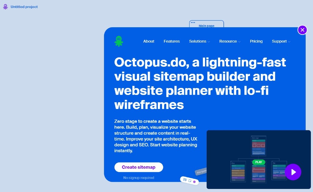
Second in our lineup of stellar website structuring tools is Octopus – a dedicated visual sitemap builder that masterfully combines simplicity and functionality. As the name suggests, Octopus reaches into the depths of website planning, bringing order to potential chaos and making the process as smooth and fluid as navigating calm waters.
Octopus is crafted specifically for constructing precise and intuitive visual sitemaps, a feature that sets it apart in the realm of website structuring tools. Whether you’re starting from scratch or building upon an existing website, Octopus provides a streamlined environment to map out your site’s architecture effectively. Its easy-to-use interface and drag-and-drop functionality make it accessible to users of varying skill levels. This tool also enables the creation of multiple sub-levels, giving a clear visual representation of your website’s depth and navigational flow. With Octopus, even the most complex website structures can be easily understood at a glance.
Features
- Interactive Visual Sitemaps
- Drag & Drop Functionality
- Customizable Templates
- Collaboration Features
- Commenting and Annotation Tools
- Figma Integration
- Export Options – PDF, PNG, TXT, XML
- Real-Time Collaboration
Pros
- Octopus shines in the transition from brainstorming to a more structured sitemap. It provides just the right balance of control and freedom, allowing you to visualize your website’s structure while still offering flexibility for on-the-go changes. Its simplicity makes it accessible, avoiding the overwhelm that some other tools can cause.
- This tool excels at translating your website ideas into a digestible format. Its user-friendly design and seamless maneuverability makes on-spot diagram alterations a breeze.
- Jump right into website structuring with Octopus’ free version, accessible directly from their landing page.
- Octopus brings a unique set of tools to the table, such as a project cost estimator, that complements your planning process beautifully.
- The ability to add sticky notes anywhere in a project offers a simple and effective way to annotate your plans, highlight important elements, or add reminders.
Cons
- The free plan restricts you to just a single project.
- Incorporating review and collaboration tools would make the process of working with clients smoother.
- Once a project is deleted in Octopus, it can’t be restored, which could potentially lead to the loss of valuable data.
- The service doesn’t clearly specify the storage limit for each plan. In comparison, competitors like Slickplan offer up to 500 GB of storage.
- Octopus lacks integration with Content Management Systems (CMS), which could limit its functionality for some users.
- It only covers part of the website planning process, with no tools included for developing content or diagramming UX/UI ideas.
- The Figma integration in Octopus relies on Figma to create design previews, limiting its standalone capabilities.
- Absence of an API restricts users from creating their own custom integrations, potentially limiting the tool’s flexibility.
Pricing plans
- Free
- $8 per month – Pro
- $34 per month – Team
- $100 per month – Agency
Pro Tip:
Octopus is a big help when I’m mapping out the sitemap for a new project. It’s got all the right features to quickly sketch out even the most complex hierarchies, and the sharing capabilities are just so straightforward.
The user interface is spot-on, offering a user experience that truly modernizes sitemap generation. It supports a collaborative workflow right from start to finish. So, all in all, it makes planning and working on a project a whole lot easier and smoother.
Favored by Top-Tier Brands
- Microsoft
- NASA
- Xero
- Sidney
- Asos
- Docusign
Ratings
- Capterra rating – 4.9
- G2 rating – 4.7
Ready to dive into Octopus? Plunge into the world of seamless sitemap generation and collaboration by checking out Octopus’s website.
3. Figma
Unlock the Art of Website Architecture with Figma: Superior Collaboration, Design Flexibility, and Precision Structure Tools at Your Fingertips!
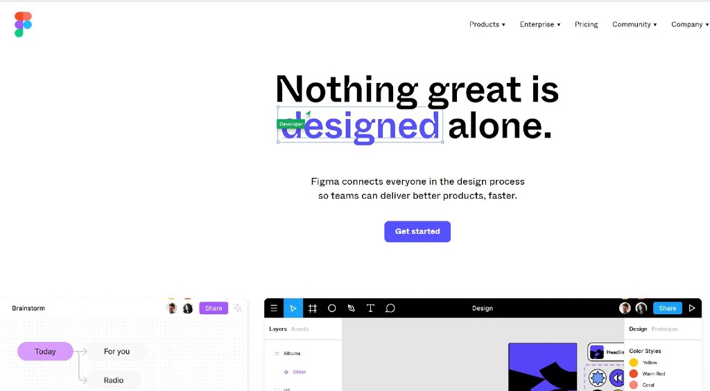
Next on our list is Figma, a powerhouse of design and collaboration and an industry favorite among many digital creators. Figma’s website structuring tools offer a blend of versatility, ease of use, and precision, making it a go-to solution for both professionals and beginners in the web development sphere.
Figma shines in its ability to create detailed wireframes and prototypes, an essential aspect of planning website structures. Its robust, user-friendly interface allows designers to create high-fidelity wireframes that effectively mimic the end product. From drag-and-drop components to a rich library of templates and elements, Figma provides all the necessities to kickstart your website structuring process.
But Figma isn’t just about design; it’s also a platform for collaboration. Its features like version history and easy shareability make it incredibly efficient for tracking changes and obtaining approvals. Moreover, Figma’s integration capabilities with tools like Slack and Zeplin ensure that it fits comfortably into your existing workflow.
Features
- Content Design Features
- Design and Editing Tools
- Unlimited File Storage
- Sketch Import Capabilities
- Export Options – PDF, PNG, JPG, SVG
- Multiple Editors on a Single File
- In-File Commenting
Pros
- Figma is delightfully easy to learn, making it accessible to novices and professionals alike.
- Real-time collaboration capabilities are a standout feature in Figma, enabling seamless teamwork from any location.
- Pixel-perfect responsive design ensures that every element you design will look crisp and precise, exactly as you intend it to appear, and is combined with a dynamic component library.
- Robust and simple to use, Figma is an ideal tool for beginners while offering extensive capabilities to satisfy experienced designers.
- Figma offers a wealth of resources with a wide array of useful plug-ins and ready-to-use templates.
Cons
- It can get a bit overwhelming to find your way around Figma when you have a lot of sketches and new designs. You find yourself constantly zooming in and out, trying to figure out the right level of detail, which can be quite tricky.
- The interface of Figma can be a tough nut to crack, especially if you’re used to working with Adobe tools or similar design software. It takes some time and effort to get acquainted with the various tools and icons.
- Sometimes, Figma can be a bit sluggish, especially when working on larger design projects. It’s frustrating when you’re in the creative zone, and things start to slow down.
Pricing plans
Pricing depends on the number of editors. For a single editor:
- Free
- $12 per editor per month – Professional
- $45 per editor per month – Organization
Pro Tip:
I personally think Figma is an excellent choice for designers who want a design tool that’s both powerful and user-friendly. It’s especially great for teams working on design projects because it makes collaboration and iteration super easy. However, keep in mind that Figma has different pricing plans, so make sure to pick the one that fits your needs the best.
Used by popular brands
- Zoom
- Slack
- Dropbox
- Herman Miller
- Carta
- DataDog
Reviews
- Capterra rating – 4.7
- G2 rating – 4.7
Experience the world of user-friendly design and seamless collaboration by visiting Figma’s website.
4. Miro
Elevate Your Site Architecture with Miro’s Dynamic Digital Whiteboard! Map out your site’s navigation and establish clear information architecture.
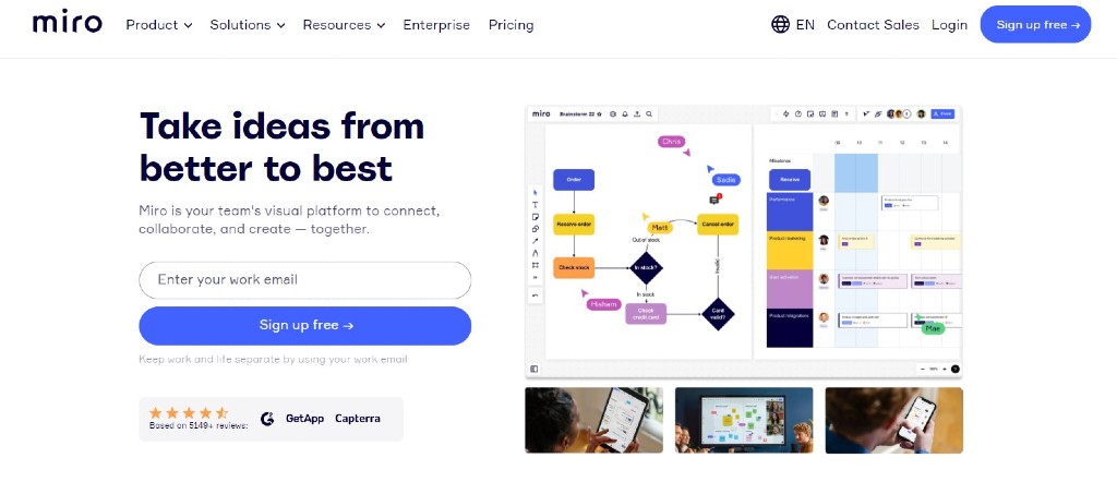
Miro is a great tool for website creators and teams, revolutionizing the process of designing and organizing website structures. With its comprehensive features, Miro provides an all-in-one solution for visualizing and planning your website’s architecture. Whether you’re focusing on website structure, internal links, site maps, or site mapping, Miro’s dynamic canvas makes creation and iteration a breeze.
With Miro, creating pages and conducting keyword research becomes a seamless task. You can also visualize user flows and gain insights into the click depth of your website, ensuring optimal navigation and a stellar user experience.
Collaboration becomes effortless with Miro, enabling effective teamwork while helping you identify important pages, eliminate duplicate content, and craft engaging website content that speaks directly to your target audience.
Features
- Templates
- Drag-and-Drop
- Mind Mapping
- Notes and Comments
- Collaborative Editing
- File Management
- Integration with Core, Jira, Confluence (depends on plan, only Core in Free version)
- Interactive Presentation Mode
- Authentication via Google, Office 365, and Slack
- Export Options – JPG, PDF, CSV
Pros
- The interface of Miro is designed with intuitive and user-friendly features, allowing effortless simultaneous collaboration for everyone on the board.
- You can observe real-time interactions with others on the board while you’re actively collaborating on it. And if you prefer some focused work time, you can easily disable this feature individually.
- Miro is fantastic for its variety of functions like mind mapping, brainstorms, and flow documentation
Cons
- While the interface is generally user-friendly, it may take some time to become fully comfortable with all the platform’s features. Getting used to the various tools and functions requires a bit of effort.
- Miro allows users to export their boards as PDFs, PNGs, or CSV files, but there is a lack of export options compatible with other software programs like Adobe Creative Suite or Microsoft Office. It would be helpful if Miro offered more diverse export formats.
- Importing large Powerpoint or PDF files is difficult, often necessitating the tedious task of manually copying slides one by one.
- Uploading non-YouTube videos to the board can be a struggle.
Pricing plans
- Free
- $8 per month – Starter
- $16 per month – Business
- Contact Miro’s sales team for an Enterprise quote – Enterprise
Flexible payment options available.
Pro Tip:
I’ve personally found Miro to be an incredibly handy tool with its extensive range of templates and drawing tools. Whether I need to create diagrams, mind maps, or any other visualizations, Miro makes it quick and easy. From the initial brainstorming stage all the way to the final delivery, Miro has been a valuable resource for me. The best part is it’s user-friendly, so I never struggle with navigating the program.
And don’t forget to explore the various templates available in Miro! They’re ready to use and can make a big difference in your project. Give them a try and see which ones suit your needs the best.
Used by popular brands
- Deloitte
- Skyscanner
- Cisco
- Dell
- Mailchimp
Reviews
- Capterra rating – 4.7
- G2 rating – 4.8
Is Miro the right tool for you? Visit Miro’s website to give it a try and see if it fits your needs.
5. FlowMapp
Bring your ideas to life on a limitless canvas – Miro, the ultimate collaborative online whiteboard.
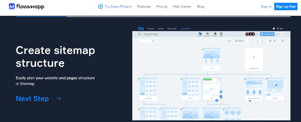
FlowMapp is a powerful web-based tool that offers comprehensive features for planning and visualizing the user experience (UX) of websites and applications. It serves as a collaborative platform that helps teams streamline their UX design processes and create efficient user flows.
One of the standout features of FlowMapp is its ability to create detailed sitemaps, allowing users to visually map out the structure and hierarchy of a website or application. This provides a clear overview of the entire project, ensuring a logical and well-organized user journey. Additionally, FlowMapp offers user journey mapping, enabling teams to visualize and analyze the paths users take while interacting with the digital product. This helps identify pain points and optimize user flows.
Collaboration is at the core of FlowMapp. Multiple team members can collaborate simultaneously, providing real-time feedback and making it easy to iterate on designs. FlowMapp’s comprehensive set of tools, including persona creation and user flow mapping, make it a versatile solution.
Features:
- Templates
- Drag & Drop pages
- Duplicate pages
- Sitemap Pages in Project
- Export Options – PDF, SVG, PNG
- Import Sitemap from XML (not available in free version)
Pros
- The interface of FlowMapp is designed to be intuitive and user-friendly, making it easy to collaborate with team members and clients.
- Within projects and comment boxes, FlowMapp allows for the creation of custom labels, enabling specific suggestions to be provided for the flow.
- FlowMapp is a high-quality tool with an excellent user experience. The technical support provided by the professionals at PopArt Studio is extremely helpful, especially in swiftly transferring projects.
- Cover images in FlowMapp help in effectively visualizing the UI and purpose of each page.
- FlowMapp provides a valuable feature for developing and assigning user personas, greatly assisting in evaluating the functionality of products and sites.
- One notable advantage over competitors lies in FlowMapp’s speed in creating and updating user flows according to specific needs.
Cons
- FlowMapp could be improved in terms of flexibility when it comes to having multiple main nodes or templates. While the current setup works for most, it would be nice to have the ability to create and customize multiple templates for different projects or clients.
- You may want to include SERP (Search Engine Results Page) information. However, currently, you have to add it as a text block within the main node. It would be great if there were a separate input field specifically designed for SERP information.
- FlowMapp does not offer the ability to bundle changes together. For example, deleting multiple pages or an entire branch of pages requires deleting them one by one. Having the option to bundle changes for efficient deletion would be a helpful addition.
- Currently, you cannot export a specific portion of a large flow map. It would be beneficial if you could selectively export sections, especially when integrating FlowMapp with other design tools, for quick and efficient work.
- The online status of coworkers is not accurately displayed.
- The XML sitemap file import feature does not support large files, which limits its usability.
Pricing plans
- Free
- $18 per month – Pro
- $54 per month – Team
- $199 per month – Agency
Pro Tip:
I find FlowMapp super easy to use and collaborate with my team members and clients. The web app has an excellent user experience (UX), which makes it both simple and enjoyable to work with. My favorite feature is the Site Map, where I can create individual pages and plan the content for each page. It’s great because it allows my clients to view and collaborate, clearly identifying the goals for each page.
The interface is intuitive and user-friendly, so I didn’t have to spend a lot of time learning how to use it. FlowMapp has everything I need to work on the UX for my apps or web projects without any unnecessary features getting in the way. Sharing my work is as easy as a single click.
One thing that stands out is the responsiveness of the support team. Whenever I had a question or needed assistance, they were fast and helpful.
What sets FlowMapp apart is that it combines user profiling (personas), user journey mapping, user flow mapping, and comprehensive site mapping tools. As far as I know, it’s one of the few tools on the market that brings all these capabilities together.
Used by popular brands
- Der Spiegel
- Accenture
- Intel
- Possible
- Unicef
Reviews
- Capterra rating – 4.7
- G2 rating – 4.7
Curious about FlowMapp and how it can benefit your team? Head over to FlowMapp’s website to explore their user-friendly platform for effortless collaboration and comprehensive UX planning.
Final Thoughts
The 5 tools discussed in this article – Lucidchart, Octopus, Miro, Figma, and FlowMapp – offer valuable capabilities for visualizing and organizing website architecture. It is important to carefully evaluate their features, pros, and cons to find the best fit for your website’s specific needs.
When making your final choice, be sure to consider search engine optimization. You can more easily establish a coherent internal link structure, generate efficient XML and HTML sitemaps, and create visual representations of your website’s architecture.
If you leverage any of these tools effectively, you can create a website structure that aligns with the algorithms and requirements of search engines. This means search engine crawlers will be able to navigate and index all your pages without trouble.
Frequently Asked Questions
Who is qualified to design a website’s structure?
A website developer with expertise in designing and developing websites is typically the most qualified individual to handle the task of structuring a website. In some cases, they may collaborate with other professionals, such as UX/UI designers, to ensure a well-rounded and user-friendly structure.
What is the tool to structure a website?
The tool commonly used to structure a website is a sitemap. A sitemap provides a visual representation of the website’s structure, showcasing the hierarchy and organization of different pages, sections, and content. It serves as a blueprint that guides the design and development process, ensuring a logical and intuitive user experience.
What are the three 3 basic website structures?
The three fundamental website structures are sequences, hierarchies, and webs. Sequences involve a linear progression, hierarchies organize content in a hierarchical manner, and webs interconnect various pages or content pieces.