
Checkout Abandonment: Common Reasons and Solutions
Getting shoppers to checkout is a win. They found a product, added it to their cart, and started taking the steps toward buying. So when they leave at that point, it usually means something in the checkout flow made them pause, rethink, or give up.
Checkout abandonment is not just a traffic problem. More often, it points to friction between the shopper and the final purchase. Unexpected costs, forced account creation, limited payment options, slow pages, unclear delivery details, or a checkout that simply asks too much can all turn high-intent shoppers into lost sales.
Research based on years of ecommerce checkout testing has found that large ecommerce sites can gain a 35.26% lift in conversion rate through better checkout design. In other words, many abandoned checkouts are not inevitable.
In this guide, we’ll look at what checkout abandonment means, how it differs from cart abandonment, the most common reasons shoppers leave during checkout, and practical ways to reduce drop-off across your ecommerce site.
For a broader overview of ecommerce abandonment trends, causes, and recovery strategies, explore our complete guide to shopping cart abandonment.
What Is Checkout Abandonment?
Checkout abandonment happens when a shopper starts the checkout process but leaves before completing the purchase.
In most ecommerce stores, that means the customer has moved past the cart and into a checkout step such as shipping information, delivery selection, payment details, or order review. They may have every intention of buying, but for some reason they leave.
Checkout vs Cart Abandonment: What’s the Difference?
In this article, we’re focusing specifically on checkout abandonment, not the broader cart abandonment rate. The two are often used interchangeably, but they refer to different moments in the purchase process.
Key Difference: Stage in the Funnel
The main difference between the two is where the shopper leaves:
- Cart abandonment happens when someone adds products to their cart but exits before beginning checkout. They may be comparing prices, checking shipping costs, saving products for later, or browsing without firm intent.
- Checkout abandonment happens after the shopper has started checkout, usually after they’ve been asked to enter shipping details, choose a delivery option, add payment information, or review the order.
Intent and User Mindset
At the cart stage, the shopper may still be pretty undecided. Adding something to the cart is often just one click, and plenty of shoppers use the cart as a holding area for products they might want. They may also be comparing prices, checking shipping, or just poking around the site.
Once a shopper clicks checkout, they have moved past casual interest and into a much more serious buying moment. They are no longer just holding items or comparing options from a distance.
Why the Distinction Matters
If a lot of shoppers leave during checkout, there is usually something in that final stretch driving the drop-off. Something is killing momentum before they place the order.
The next step is to figure out where that resistance is coming from. What are their reasons for leaving? Once you know what is getting in the way, you can make targeted changes to improve the checkout experience.
Learn more about the broader ecommerce abandonment journey in our shopping cart abandonment guide.
Shopping Cart Abandonment: A Complete Guide for Ecommerce
Most online shoppers do not buy the first time they show interest. They browse, compare, hesitate, check shipping, look for coupon codes,…
Why Checkout Abandonment Happens (Key Reasons)
You can’t reduce checkout abandonment until you know what is causing it. A high drop-off rate tells you shoppers are leaving, but it does not tell you whether they are reacting to cost, confusion, trust concerns, payment limits, delivery issues, or the checkout flow itself.
Most checkout abandonment reasons are fixable once they are clearly identified. The goal is to find the points where shoppers hesitate, then adjust the experience so completing the order feels easier, clearer, and safer.
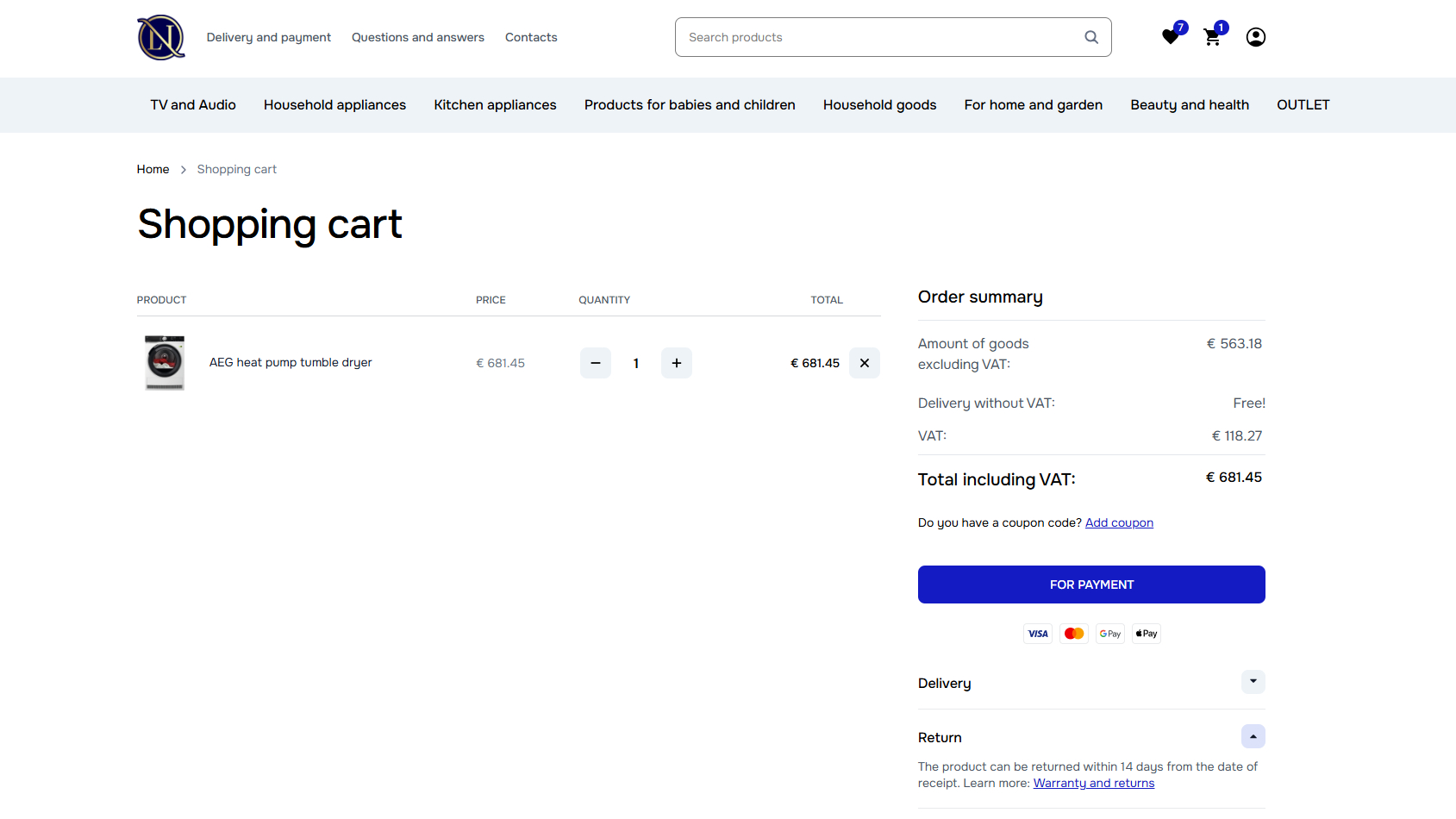
1. Unexpected Costs
Unexpected costs are one of the fastest ways to lose a shopper during checkout. If someone reaches the final steps and suddenly sees a higher total than expected, the purchase can start to feel less worthwhile. It can also leave a bad impression, as if the real cost was intentionally held back until the shopper was too far along.
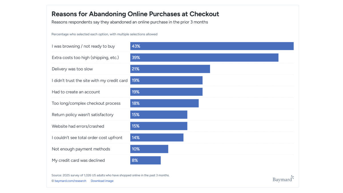
This is a common issue. 39% of shoppers who abandoned a cart said they left because extra costs were too high.
Those costs can include things like:
- Shipping – The biggest friction point, especially when the shopper only discovers the delivery cost after entering their address.
- Taxes – Expected in many cases, but still enough to change how the final total feels once it appears.
- Service fees – Frustrating because they can feel vague unless the store clearly explains what the fee covers. Examples include small-order fees, payment processing fees, personalization charges, marketplace fees, special packaging fees, or installation and assembly costs.
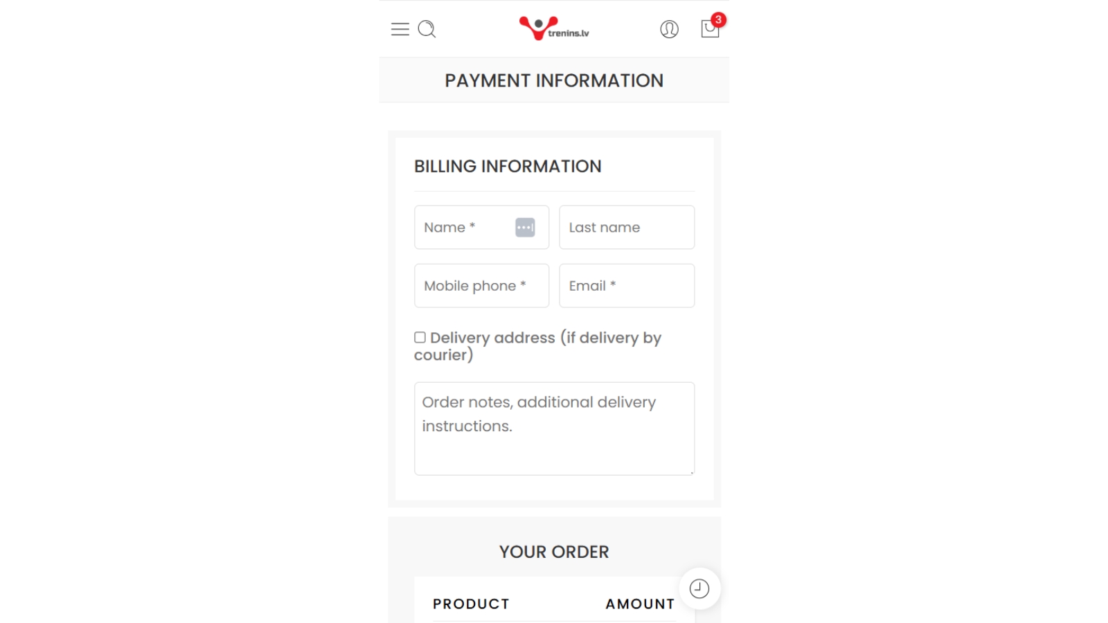
2. Complicated Checkout Process
A long or clunky checkout gives shoppers more chances to stop. Every extra field, step, distraction, or required action adds a little more effort at the exact point where the purchase should feel simple.
Common friction points include:
- Forced account creation (especially with email verification requirements)
- Too many screens/steps
- Too many form fields
- Checkout pages cluttered with pop-ups, promo-code distractions, and unnecessary upsells
According to a 2026 checkout study by Baymard Institute, 19% of online shoppers said they abandoned checkout because they were asked to create an account, while 18% left because the process was too long or complicated.
Pro Tip:
In our experience, small changes can make a real difference here. Removing unnecessary fields, offering guest checkout, and keeping the flow focused gives shoppers fewer chances to get frustrated before the order is complete.
3. Trust and Security Concerns
Checkout is where trust starts to affect the sale directly. Shoppers are being asked to share personal details, payment information. If the page feels outdated, unclear, inconsistent, or even slightly suspicious, 19% of shoppers may leave because they do not trust the site.
That hesitation can come from:
- Missing security badges
- Unfamiliar payment flows
- Vague return policies
- Limited contact information
- A checkout page that looks different from the rest of the site
Strong security only helps if shoppers can recognize it. Many ecommerce checkouts are technically secure, but that does not automatically make them feel safe to the customer. The page should make those protections visible so shoppers feel comfortable entering their information and completing the purchase.
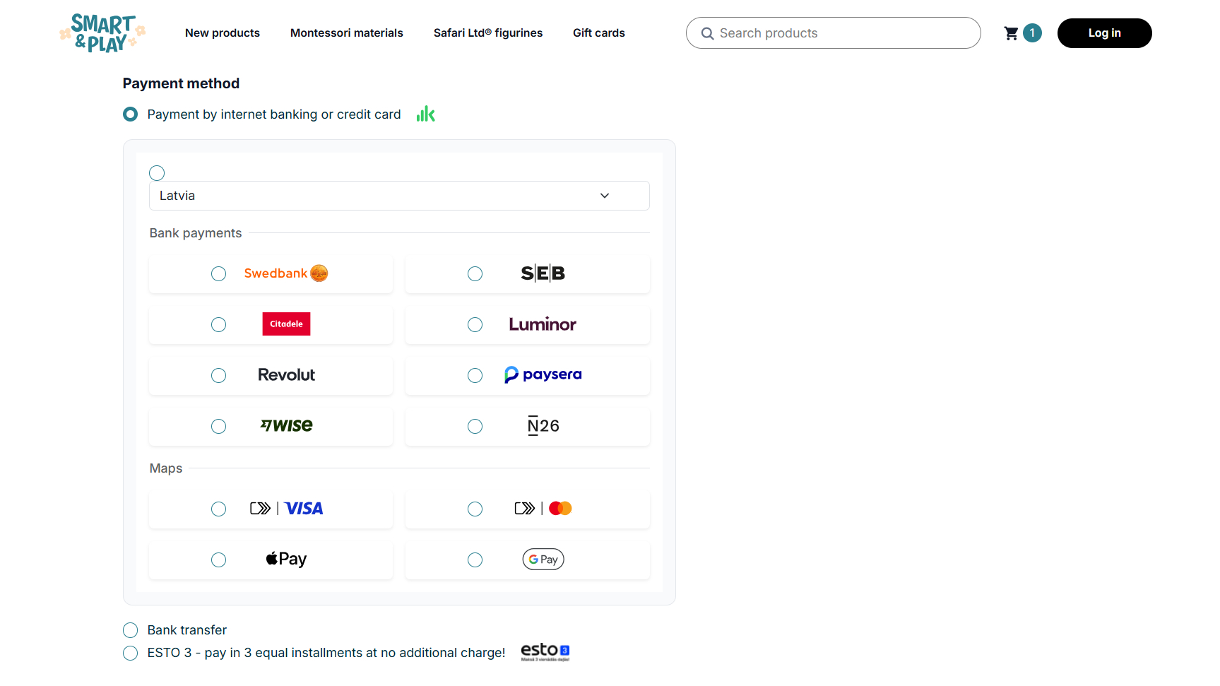
4. Limited Payment or Delivery Options
Limited payment options can block a purchase at the final step. If shoppers reach checkout and do not see a payment method they can or want to use, they may have no reason to keep going.
The same is true for delivery. A customer may be ready to buy, only to find out that the store does not ship to their location or that the available delivery partner does not serve their area. At that point, abandonment is not really hesitation. The checkout has given them no workable path to finish the order. This comes up often with mobile shoppers and international customers.
The fix is not to offer every possible option. It is to make sure the checkout supports the payment and delivery methods your shoppers are most likely to need.
5. Technical and UX Issues
Technical problems can push shoppers out of checkout quickly, especially on mobile. People expect the page to load fast, respond properly, and let them finish the order without delays. If the checkout is slow or unstable, many shoppers will not wait around.
Errors are just as damaging. A payment issue, broken button, address field problem, or form validation message that does not clearly explain what went wrong can make the checkout feel unreliable. Once that happens, the shopper may lose confidence and buy the same product somewhere else.
Technical and UX issues often include:
- Poor mobile usability
- Slow-loading pages
- Form errors or validation issues
The checkout page should not only work correctly, but also help shoppers spot and fix mistakes before they submit the order.
If you want to learn about the most common user behavioral signals that indicate checkout abandonment, read our article on cart abandonment behavior signals in ecommerce.
How to Measure Checkout Abandonment
Accurately measuring checkout abandonment is essential for understanding where users drop off and which parts of the checkout process create the most friction. Without proper tracking, businesses risk making assumptions instead of data-driven decisions.
1. Calculate Your Checkout Abandonment Rate and Monitor It
Checkout abandonment rate shows the percentage of shoppers who start checkout but leave before completing the order within a set period.
A high rate usually means something in the checkout flow is creating friction. That could be unexpected shipping costs, a long form, forced account creation, payment issues, or a confusing final step.
To figure out your checkout abandonment rate, you need to divide the total number of completed transactions by the number of initiated checkouts, subtract that result from 1, and multiply by 100.
For example, if 500 users initiated checkout, but only 350 completed the purchase, the calculation would look like this:
(1 – (350 / 500)) × 100 = 30%
This means 30% of customers who started payment did not finish the purchase.
2. Define Your Checkout Funnel
Start by mapping the actual steps shoppers move through before an order is completed. This gives you a clearer view of where the checkout process isn’t working.
The exact checkout funnel will depend on your ecommerce setup, but it usually includes steps like:
- Cart view
- Shipping information
- Delivery options
- Payment details
- Final order review
- Purchase confirmation
Some stores combine steps. Others add more depending on how checkout is set up, such as discount codes, account login, address validation, financing options, or third-party payment redirects.
It’s important to track each step separately so you can see where the biggest drop-off happens.
3. Use Analytics and Behavior Tracking Tools
Analytics tools help you see where checkout is breaking down instead of relying on guesses. Google Analytics, Hotjar, and ecommerce analytics platforms can show how shoppers move through checkout, where they leave, and whether the problem is tied to a specific device, traffic source, or step in the process.
Analytics tools, like Google Analytics, can help you track things like:
- Where shoppers drop-off
- Abandonment patterns for specific devices
- How changes affect completion rates
Behavior tracking tools, such as heatmaps and session recordings, can show what the numbers do not, including:
- Hesitation through repeated clicks or stalled form progress
- Interaction issues like misclicks or failed dropdown selections
- Confusing page elements
eComStrive’s Web Analytics services can help you set up clean GA4 tracking, so you can find the right areas for targeted fixes.

4. Segment Checkout Abandonment Data
Overall checkout abandonment rate is useful, but it can hide the real problem. Breaking the data into segments helps you see whether certain shoppers are leaving more often than others:
- New vs. returning customers – New shoppers may leave because they do not fully trust the brand yet, cannot find the return policy, or feel unsure about entering payment details. Returning shoppers may be reacting to a slower checkout process, limited delivery options
- Geographic location – If abandonment is higher in certain regions make sure delivery estimates are clear and currency feels consistent.
- Time of day or week – Evening or weekend abandonment can signal more casual shopping, especially on mobile. In those cases, make it easy to return later and keep cart details saved.
5. Focus on actionable insights
Tracking checkout abandonment is only useful if it leads to better decisions. Watch how the rate changes over time, especially after you adjust the checkout flow or look at specific customer segments.
Turn those findings into a simple but systematic improvement process:
- Review checkout abandonment metrics regularly
- A/B test possible fixes
- Apply changes based on the data, not assumptions
- Measure the impact of each change
The goal is not to react to every small movement in the numbers. It is to find the patterns that point to real friction, then fix the parts of checkout that are routinely costing you sales.
For a broader overview of abandonment metrics, see our guide on cart abandonment rate. To learn how to reduce friction across the entire purchase journey, explore reduce cart abandonment.
How to Reduce Checkout Abandonment
Reducing checkout abandonment comes down to removing the small points of friction that make shoppers pause before they buy. The checkout should feel clear, fast, and easy to complete, with the important details visible before the customer has to hunt for them.
Here are some of the most effective ways to improve the checkout experience:
Simplify the Checkout Structure
A simpler checkout gives shoppers fewer chances to get stuck or second-guess the purchase. The goal is not to strip out every detail, but to keep only the steps and fields that are needed to complete the order.
To improve usability:
- Reduce the number of checkout steps – Use a one-page checkout when it makes sense, or break the process into a few clear steps so shoppers know exactly where they are.
- Remove unnecessary form fields – Only ask for the information needed to process the order, deliver the product, and handle customer communication. Extra fields can make checkout feel longer and may raise privacy concerns.
- Clearly indicate progress throughout checkout – If checkout has multiple steps, use a progress indicator so shoppers can see how close they are to finishing.
A long checkout gives people more time to reconsider. A shorter, clearer flow helps them keep moving while they still feel ready to buy.
Offer Guest Checkout
Forced account creation can make checkout feel like more of a commitment than the shopper wants. Some customers are ready to buy, but they do not want to create a password, confirm an email, or join another system just to place one order.
Instead of requiring registration:
- Allow guest checkout
- Offer account creation as an optional step
- Explain account benefits without interrupting the checkout flow
Account creation can still be useful, especially for order tracking, faster reorders, and loyalty programs. But it should feel like a helpful option, not a condition for buying.
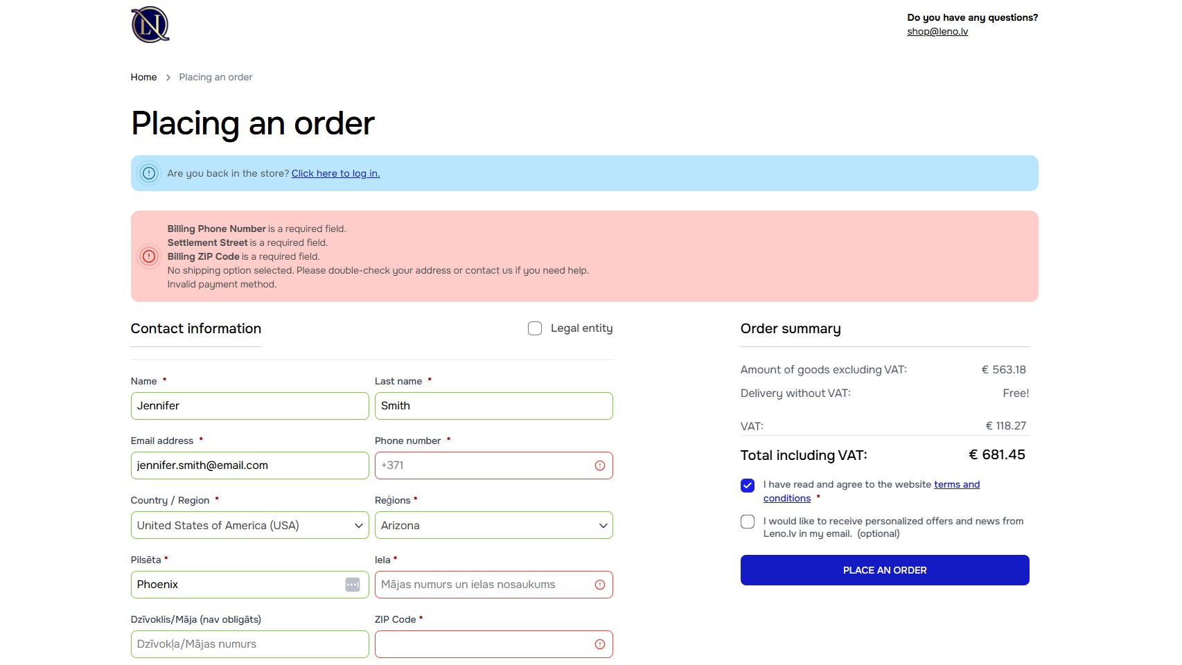
Improve Form Usability
Checkout forms should be easy to understand and hard to get wrong. If shoppers have to guess what a field means, re-enter information, or fix unclear errors, the form becomes a reason to leave.
Prioritize form details such as:
- Clear field labels
- Inline validation
- Autofill support
- Mobile-friendly input fields
Small form improvements can remove a surprising amount of friction. Clear labels and useful error messages help shoppers correct mistakes quickly and move through the checkout process as intended.
Make Pricing and Delivery Information Clear
Pricing and delivery details should not appear as a surprise at the last step. If shoppers only see shipping costs, taxes, fees, or delivery timelines on the payment page, the final total can feel very different from what they expected.
Clearly communicate:
- Shipping costs
- Taxes and fees
- Estimated delivery times
- Return policy details
The earlier shoppers understand the full cost and delivery expectations, the less likely those details are to derail the purchase later. Clear information does not remove every objection, but it gives customers fewer reasons to leave.
Reinforce Trust During Payment
Payment is where shoppers need the strongest sense of security. They may be ready to buy, but they still need to feel comfortable handing over card details, billing information, and personal data.
To increase confidence:
- Display secure payment indicators and money-back guarantees
- Show recognizable payment methods and logos
- Maintain consistent design throughout checkout
- Avoid redirects or confusing payment flows
The checkout experience should make the business feel legitimate and the payment process feel safe. Trust badges, security messaging, familiar payment options, and clear policies all help, but they need to support the page naturally rather than clutter it.
Optimize Mobile Checkout Experience
Mobile checkout needs its own attention. A checkout flow that works fine on a desktop can still feel slow, cramped, or awkward on a phone, especially when shoppers have to type a lot or move through several screens.
To reduce mobile friction:
- Minimize typing requirements
- Use mobile-friendly payment methods
- Optimize loading speed
Pro Tip:
In many ecommerce stores, mobile checkout abandonment is higher because the experience is harder to complete, not because the shopper is less interested. Make sure forms are easy to tap through, payment options like Apple Pay or Google Pay are available where relevant, and pages load quickly without unnecessary distractions.
For broader ecommerce strategies beyond checkout optimization, explore our guide on how to reduce cart abandonment.
Improving checkout completion rates often requires ongoing UX testing and conversion optimization. That’s where our Conversion Optimization (CRO) services can help, by finding the friction in your checkout flow, testing better paths, and turning more checkout visits into completed orders.

Close the Gaps Before the Final Click
From an ecommerce perspective, checkout abandonment is frustrating because the shopper has already made it deep into the buying journey. They found the product, started the process, and still left before buying. But that also makes it one of the most useful places to look for improvement.
The issue might be cost, trust, speed, payment options, mobile usability, or a checkout flow that asks too much at the wrong moment. Funnel data, customer segments, heatmaps, session recordings, and A/B tests can help you diagnose specific points of friction.
Once you know where people are leaving and why, you can make targeted changes. A strong checkout does not need to be flashy. It just needs to feel clear, secure, and easy enough for shoppers to finish what they came to do.
Frequently Asked Questions
What is checkout abandonment?
Checkout abandonment is when a customer starts the website cart checkout process and then navigates away without completing the purchase.
Why am I getting abandoned checkouts?
The most common reasons behind checkout abandonment include unexpected costs, complicated checkout flows, mandatory account creation, limited payment options, trust concerns, and poor mobile usability.
How to fix checkout abandonment?
You can reduce checkout abandonment by making the checkout process faster, clearer, and easier to complete. That usually involves removing unnecessary steps, offering guest checkout, improving page speed, showing costs and delivery details early, supporting the payment methods your customers use, and making the final payment step feel secure.