
How Many Wireframes Do You Need When Building Website?
Let’s talk about the million-dollar website and app design question: how many wireframes do you need for your project? It’s a common question, and the answer might surprise you – it’s not an exact science. The truth is the number of wireframes you’ll need depends on various factors, like the type of website you are creating and it’s size and complexity. But fear not; we’re here to help you navigate this wireframing journey and find the sweet spot that works for your project.
What Are Wireframes?
Wireframes are like the blueprint for your digital project, be it a website, app, or any other interactive user interface. They serve as a skeleton or rough sketch of the final design, focusing on layout, functionality, and overall user experience.
If you want to learn more about wireframes, check out ‘What Are Wireframes and What to Include?’
They’re super handy when you’re in the early stages of designing because they help you focus on what matters: the layout, functionality, and overall user experience.
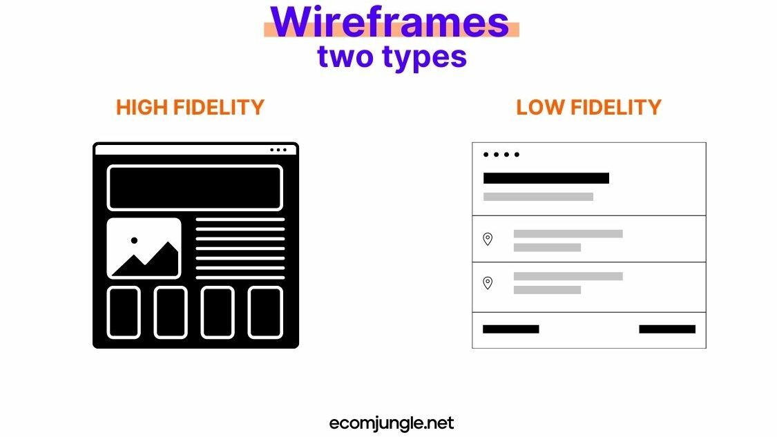
Wireframes come in two types: high fidelity and low fidelity.
High fidelity wireframes are more detailed and closer to the final design, incorporating specific UI elements and components.
On the other hand, low fidelity wireframes are basic, grayscale representations with simplified UI components.
By stripping away all the bells and whistles (like colors, images, and typography), wireframes allow you to focus on what’s truly important: the user experience. They help you visualize how users will navigate and interact with your design, ensuring the layout is intuitive, functional and user-friendly.
Using wireframes, you can map out the layout, including buttons, images, text, and other interactive elements, and create a sitemap without getting distracted by colors, fonts, and other visual details.
The cool thing about wireframes is that they make communication between team members a breeze. They serve as a visual reference for designers, developers, and stakeholders, so everyone’s on the same page from the get-go. Plus, they make it easier to spot potential issues or improvements, saving you time and headaches down the road.
Define User Flow and Goals
Before diving into wireframing, you must have a solid grasp of the number of screens you’ll be designing and how users will engage with them by outlining user flow and user goals. This is the bread and butter of your UX designers.
Complex User Flow Steps Means More Wireframes
User flow is users’ path as they navigate through your website or app. It outlines their steps to complete a specific task, like making a purchase or signing up for a newsletter. Designing an intuitive user flow is crucial for a smooth and satisfying user experience.
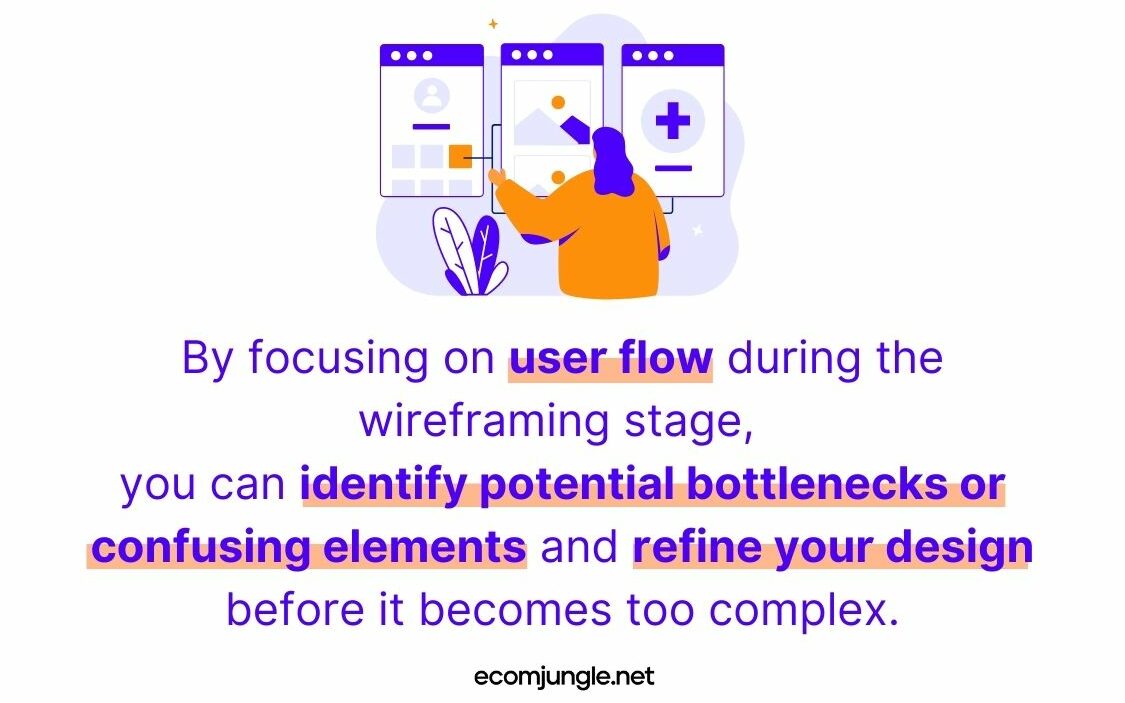
When creating wireframes, mapping out the user flow first is essential. This helps you visualize how users will move from one screen to another and ensures that each step in the process is logical and straightforward. By focusing on user flow during the wireframing stage, you can identify potential bottlenecks or confusing elements and refine your design before it becomes too complex.
Bottlenecks and other confusing elements can increase the number of wireframes because your team made new to design additional iterations to resolve the problems these elements create. When a user flow has unclear or inefficient steps, designers need to create alternative wireframes to address these issues.
Meeting User Goals Equals More Wireframes
User goals are the objectives that users want to achieve while interacting with your website or app. These goals can range from finding specific information to completing a transaction. To achieve a particular goal, a user might try a few different paths; that’s why user flows may not be linear. Understanding your users’ goals is critical for designing a layout and navigation that meet their needs and expectations.
During the wireframing process, keep your users’ goals front and center. This will help you create a design that’s visually appealing but also functional, and user-friendly. Consider how your users interact with each screen, and ensure their goals can be easily achieved with minimal clicks or taps.
The focus on user goals can lead to fewer wireframes, as you prioritize efficient and goal-oriented design from the start, reducing the need for multiple iterations to address usability issues.
How Many Wireframes? Finding the Sweet Spot For Your Site
To nail down the answer to “How many wireframes do you need?” it’s essential to recognize that not all websites serve the same purpose.
The number of wireframes you’ll need at the beginning of a website design project hinges on the project’s size, complexity, and type. Smaller sites typically require fewer wireframes than larger ones, but there can always be exceptions.
For instance, the website of a law office, which primarily informs clients about available services, will be quite different from an eCommerce website. The less complex a website is, with fewer pages, intricate details, and unconventional features, the fewer wireframes you’ll need to create.
Ultimately, the website’s sitemap is the determining factor for the number of wireframes. Consider the site’s organization and the various levels of pages or page types needed to convey the intended message and functionality.
A sitemap outlines the overall structure and hierarchy of your website, which directly impacts the number of wireframes as each unique page or interaction may require its own wireframe. However, it is important to consider the diversity of layouts as well. If many pages have similar layouts, fewer wireframes may be needed, as one wireframe can represent multiple pages sharing the same structure.
On the other hand, if your site contains a wide variety of unique layouts, more wireframes will be necessary to account for the different design elements and user interactions. Balancing sitemap complexity with layout diversity will help you determine the optimal number of wireframes for your project.
Here’s a list of common wireframes you might want to incorporate, addressing various use cases and user experiences:
- Home Page
- About Us
- Content Pages incorporating images, text, videos, paragraphs, etc.
- Contact Us Page
- Maps or Location-based Pages
- User account or settings pages
- Pages with heavy data visualizations or tables
Wireframes for Basic and Fully Developed Websites
From our experience, we’ve found that clients don’t always require expansive websites. Their needs vary based on the site’s purpose and available budget, affecting the desired functionality. For instance, a client seeking a homepage for marketing efforts will have different expectations than one looking to develop an eCommerce page.

In this article, we’ll explore four distinct scenarios:
- Basic wireframes (MVP) for an eCommerce Website
- Wireframes for a fully developed eCommerce Website
- Basic wireframes for a Service-based Website
- Wireframes for a fully developed Service-based Website
Minimum Viable Product for an eCommerce Website
When creating a minimum viable product (MVP) wireframe for an eCommerce site, it’s essential to focus on the core features that will provide a functional and user-friendly shopping experience. An MVP wireframe should be streamlined, including only the most crucial elements to test your concept, gather user feedback, and iterate on your design.
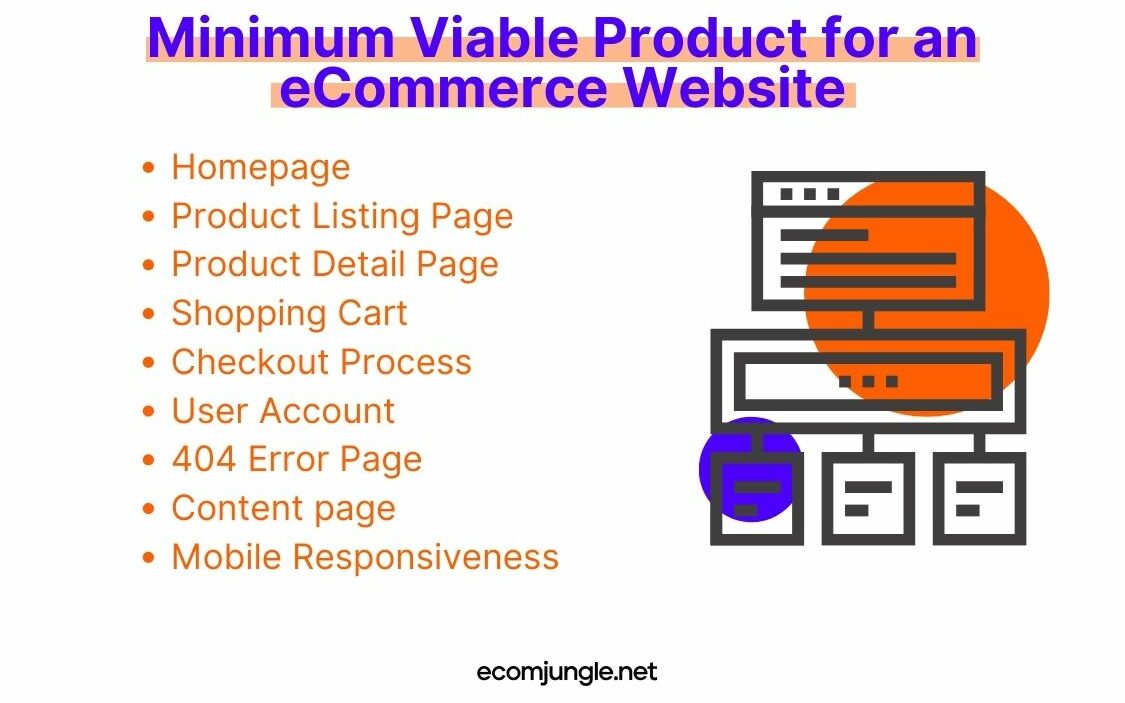
Here’s a breakdown of the key components you’ll probably want to include in your basic wireframe design for an eCommerce site:
- Product Listing Page – Create a simple layout that displays your products in an organized manner, including essential information like product images, names, and prices. Don’t forget to include filtering and sorting options to help users find what they’re looking for.
- Shopping Cart – The shopping cart should give users an overview of their selected items, quantities, and a subtotal. Include options to update quantities, remove items, and proceed to checkout.
- Checkout Process – Design a straightforward checkout process that guides users through entering their shipping information, selecting a payment method, and review their order before submitting it. Aim for as few steps as possible to minimize friction and reduce cart abandonment.
- User Account – Allow users to create accounts to save their shipping and payment information, view order history, and manage their preferences. This will streamline the checkout process for returning customers.
- 404 Error Page – When users follow a broken or non-existent link on your site, they arrive at a 404 page. This is the HTTP status code your server sends when the browser requests a page that can’t be found.
- Content page – Utilize HTML, CSS, and JavaScript to create dynamic and visually appealing pages, allowing you to seamlessly manage various content types. Implement elements like hero sections, H1 and H2 headings, ordered or unordered lists, and paragraphs to enrich the experience for your customers.
Pro Tip:
Remember, the goal of MVP wireframes for an eCommerce site is to focus on the essential features that enable users to complete their shopping journey seamlessly. Once you’ve gathered feedback and validated your concept, you can refine your design and add more advanced features to enhance the site.
Fully-Developed Ecommerce Website
Once you’ve established your eCommerce business using the MVP wireframes, a time will come when you want to expand into a more developed website to help your business grow. By offering more secondary pages and features you can enhance the user experience, improve engagement, and drive conversions.
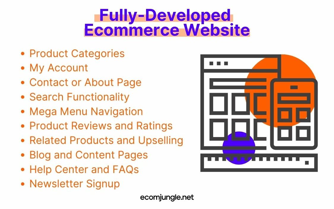
There are really dozens of possible directions you could go and dozens of pages you could create. Focus on the ones that give your customers the most value while giving you the greatest return. Here are some potential ideas to add to your expanded wireframe:
- Product Categories – The category page is a crucial link between your homepage and individual product pages. As the next significant step in your sales funnel, it helps users narrow down their options and find their desired products more easily, ultimately encouraging them to make a purchase.
- My Account – The “My Account” page offers a range of self-service tools for logged-in users to access and manage their account information, personal details, and order history on the storefront.
Pro Tip:
In the first version of the website, the My Account page may not be created, as this page is intended to improve the user experience. However, it is not mandatory.
- Contact or About Page – Virtually every website features a “Contact Us” or “About Us” page (or even both). Designing wireframes for one or both of these pages early on is crucial, as they are often among the most visited and vital components of any website.
- Search Functionality – When expanding your site, you can upgrade the search functionality to offer more complex search layouts that extend beyond your product details page. Consider implementing autocomplete suggestions and advanced search filters for a more refined experience.
- Product Reviews and Ratings – Add a section for customer reviews and ratings on your product detail pages. This feature builds trust and helps potential buyers make informed decisions.
- Help Center and FAQs – Create a dedicated help center or FAQs page to address common customer questions and concerns. This can reduce the burden on your support team and provide instant assistance to users.
Minimum Viable Product for a Service-based Website
Service-based websites primarily exist to market your businesses services, be it legal services, consulting, software development, or landscaping. When creating this type of website, you want to start with a streamlined foundation of wireframes that communicates your brand’s message and services, while engaging your target audience.
By focusing on the essentials first, MVP wireframes allow you to test your concepts, gather user feedback, and fine-tune your design before investing in more advanced features. MVP wireframes are also much better to use to get your website launched faster when working with a smaller budget. In this section, we’ll explore some compelling elements of an MVP wireframe for a marketing-centric website:
Pro Tip:
You will want to use many of the wireframes covered in the section on MVP Wireframes for an Ecommerce Website. Here were are just covering the wireframe specific to marketing websites.
- Homepage – The homepage should present an engaging display of highlighted services and special offers to captivate visitors and encourage them to delve deeper into exploring your website.
- Service Detail Page – Create a dedicated page for each service, offering more in-depth information and highlighting the benefits and features. This page should include engaging visuals, persuasive copy, and clear calls to action, encouraging users to inquire or make a purchase.
- Content Pages – Develop engaging pages using HTML, CSS, and JavaScript to create and manage diverse content pages. Incorporate elements like hero sections, H1, H2 headings, ordered lists, and paragraphs to customize each page to your needs.
- 404 Error Page – When users follow a broken or non-existent link on your site, they arrive at a 404 page. This is the HTTP status code your server sends when the browser requests a page that can’t be found.
Fully-Developed Service-Based Website
As your service-based website evolves and gains traction, it’s time to consider an expanded wireframe that incorporates additional features and pages to further engage your audience and drive conversions.
In this section, we’ll delve into the various elements you can add to your expanded wireframe to take your marketing-focused website to the next level:
- Blog List Page – Design a captivating blog list page that displays your articles in a list or grid format, inviting users to explore your content. Make sure the layout is visually engaging and includes key information like article titles, featured images, and publication dates.
- Portfolio Showcase Page – Showcase your work with a portfolio page that displays your projects in a list or grid format. Provide a snapshot of each project, including a thumbnail image, title, and brief description to pique users’ interest.
- Portfolio Project Page – Design a dedicated page for each portfolio project, highlighting the details and successes of your work. Include compelling visuals, project objectives, and the results you achieved, demonstrating your expertise and the value you bring to your clients.
What About Wireframes For Mobile Apps?
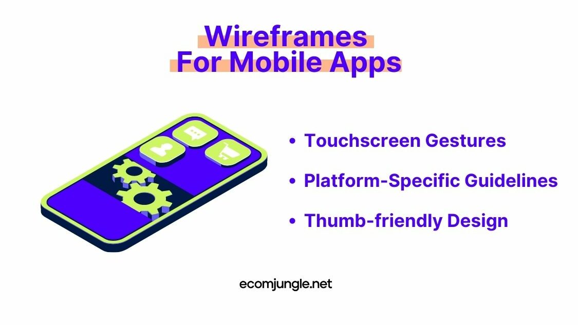
When it comes to wireframing mobile apps, there are some unique considerations to keep in mind to ensure a seamless user experience and functional design. This is in no way an exhaustive list, but a good starting point for the kinds of things you need to take into account:
- Platform-Specific Guidelines – Each mobile platform, such as iOS and Android, has its own set of design guidelines and conventions. Be mindful of these when creating your wireframes to ensure your app feels native and adheres to platform-specific best practices.
- Thumb-friendly Design – Since users primarily interact with mobile apps using their thumbs, consider the “thumb zone” when designing your wireframes. Position frequently used elements and call-to-actions within easy reach of the thumb for maximum usability.
Takeaways
In this article, we’ve discussed the ins and outs of wireframing for websites, whether they’re focused on marketing or eCommerce. Remember, the number of wireframes you’ll need depends on your project’s size, complexity, and purpose. Here’s a quick recap of the essential points we’ve covered:
- Wireframes are the blueprint for your digital project, focusing on layout, functionality, and user experience.
- Start with a solid user flow and a clear understanding of your site’s organization and hierarchy.
- The number of wireframes you need will depend on your website’s purpose, complexity, and the various user experiences you want to address.
- An MVP wireframe focuses on the essential features, while an expanded wireframe includes additional elements to enhance the user experience and deepen your connection with your audience.
- Mobile app wireframes may require specific adjustments to ensure a smooth and intuitive user experience on various devices and operating systems.
Wrapping Up
The number of wireframes you need for a successful website design project depends on various factors. There isn’t a one-size-fits-all answer to this question, but the insights shared in this article should help you determine what’s suitable for your project.
As you embark on your wireframing journey, always prioritize the user experience and maintain open communication with your team. This will help you create a website that is not only visually appealing but also functional and user-friendly. Happy wireframing!
Frequently Asked Questions
How Many Wireframes Do You Need?
The number of wireframes needed depends on the project’s scope and scale, considering the site’s size, complexity, and unique features.
Do you need a wireframe for every page?
No, you do not need a wireframe for every page. Wireframing the most important pages and template-like pages is sufficient, as these can guide the design and functionality of other pages on the site.
Why are wireframes important?
Wireframes are crucial as they connect information architecture to visual design, clarify consistent UI display methods, and determine intended interface functionality, ultimately enhancing communication among team members and ensuring a user-friendly experience.