
What Are The Different Types Of Wireframes?
A wireframe is like the architectural plan for a webpage’s interface. It’s a two-dimensional sketch that maps out where everything will go on the page and the importance of each element. It outlines the bare-bones of functionalities and intended behaviors, keeping the focus clear by leaving out decorative aspects like styling, color, or graphics. By placing emphasis on space allocation and content prioritization, wireframes serve as a crucial guidepost in the journey of creating effective user interfaces.
More about what are wireframes you can read in this article.
In the world of web design, you will encounter three key types of wireframes – low-fidelity, mid-fidelity, and high-fidelity, each distinguished by their level of detail, precision, and how closely they mimic the final product.
This article will guide you through the captivating world of wireframes, breaking down the types into low-fidelity, mid-fidelity, and high-fidelity. We’ll dive deep into what distinguishes each type, how they fit into the design process, and the kind of detail and functionality they typically encompass. By the end, you’ll have a clear understanding of the role of wireframes in digital design and be armed with the knowledge to create wireframes that can progress to effective websites.
Wireframing Process Overview
To create effective user interfaces, designers utilize digital wireframes and various digital tools, leveraging visual design principles and wireframe templates. Throughout the wireframing process, designers collaborate with the development team to refine the wireframes, ensuring they align with the site’s information architecture and cater to user feedback.
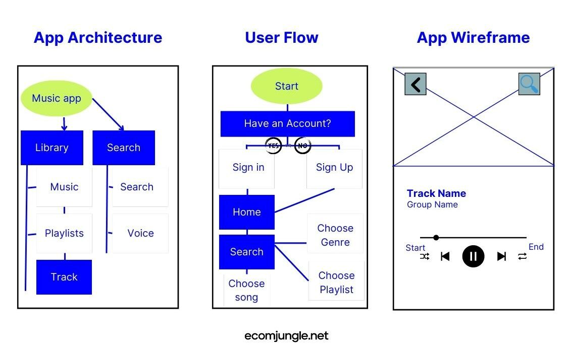
As the wireframes progress, they evolve from initial sketches to high-fidelity representations, showcasing interactive features and the final layout. Ultimately, wireframes play a vital role in the product life cycle, providing a blueprint for the final design and enabling the creation of compelling websites.
Low-Fidelity Wireframes
Low-fidelity wireframes, often referred to as ‘lo-fi,’ represent the raw, conceptual starting point of your websites or mobile apps. They’re the initial sketches, frequently created with no regard for scale, grid, or pixel accuracy, paving the way for the layout, functionality, and user flow of your interface. Their simplistic, rough visuals, typically drawn in grayscale and using generic fonts, allow designers to focus on the fundamental structure and hierarchy of a page, free from distractions of color, typography, or specific UI components.
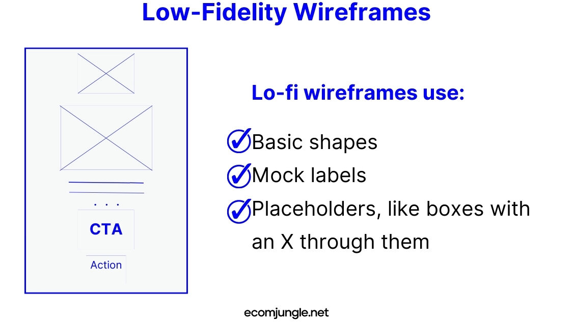
Instead of featuring actual content, lo-fi wireframes use:
- Basic shapes
- Mock labels
- Placeholders, like boxes with an X through them
This minimalist approach keeps the focus on the intended behaviors, interactions, and the site’s information architecture, making them an excellent tool for sparking conversations, deciding on the navigation layout, and mapping out the user journey.
Creating low-fidelity wireframes is usually the first step in the wireframing process and is often done rapidly and with a high degree of flexibility. It’s a time for designers to experiment with different layouts, flows, and interactions, setting the stage for the more detailed design work to come.
Some designers prefer to kickstart the wireframing process by starting with paper wireframes. This tactile approach allows them to quickly sketch out ideas, explore different layouts, and iterate on the spot.
And don’t forget low-fidelity wireframes aren’t just for desktop layouts. As more users access websites and apps from their mobile devices, creating wireframes for mobile versions of your interface is increasingly important. Some designers even prefer to start with mobile wireframes, adapting their designs for desktops later in the process.
Mid-Fidelity Wireframes
Serving as the crucial link between the rudimentary sketches of low-fidelity wireframes and the polished end-product, mid-fidelity wireframes bring a more nuanced perspective of the user interface elements and the page structure. They start to outline the various UI components, incorporate some text content, and hint at interaction details.
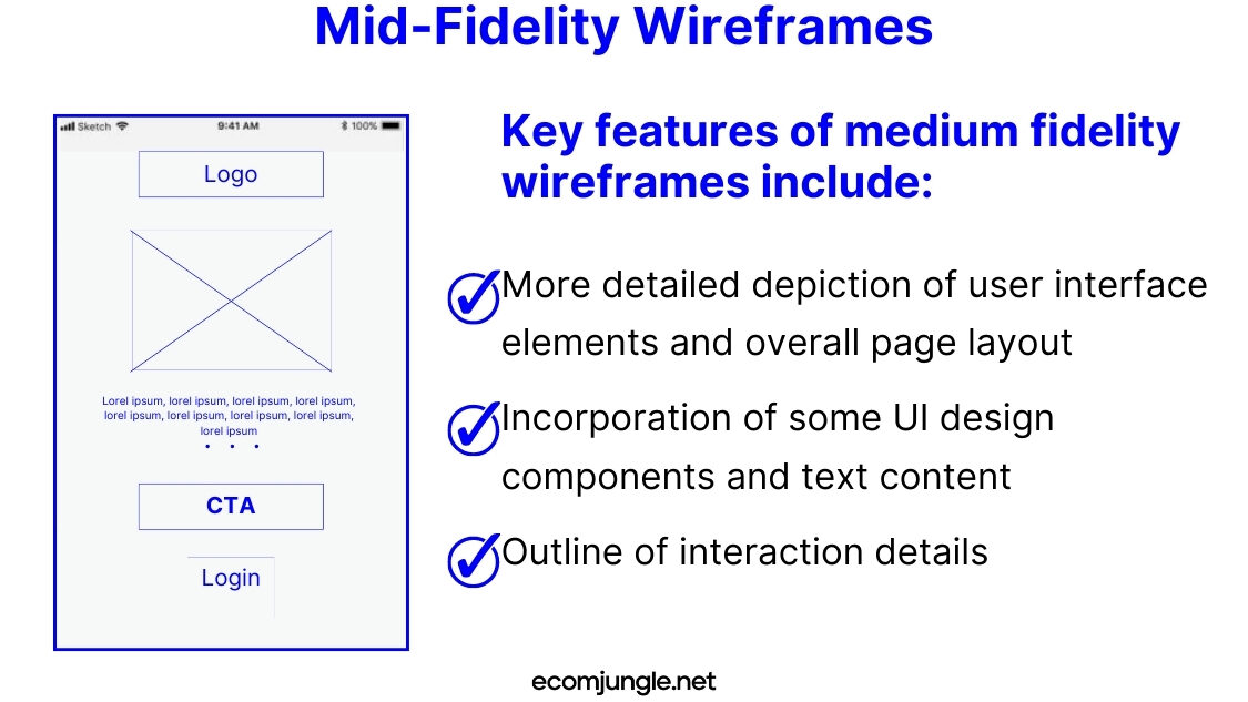
Key features of medium fidelity wireframes include:
- More detailed depiction of user interface elements and overall page layout
- Incorporation of some UI design components and text content
- Outline of interaction details
While they provide more context and more detail for the development team than their low-fidelity counterparts, medium fidelity wireframes still maintain a sense of restraint. They steer clear of full colors, images, and specific fonts, instead using a monochrome palette, often employing shades of grey to underscore the visual prominence of individual elements.
Typically created using digital wireframing tools like Sketch or Balsamiq, mid-fidelity wireframes mark a departure from the hand-drawn feel of low-fidelity ones. They put the focus squarely on content layout and overall structure, proving ideal for visualizing the intended functionality, showcasing interactive features, and prioritizing content and functionalities in line with user and business needs. Despite their more refined nature, they stay away from potential distractions such as images or specific typography.
High-Fidelity Wireframes
High-fidelity wireframes, the pièce de résistance of the wireframing process, are the most intricate and visually similar to the final product among the different types of wireframes.
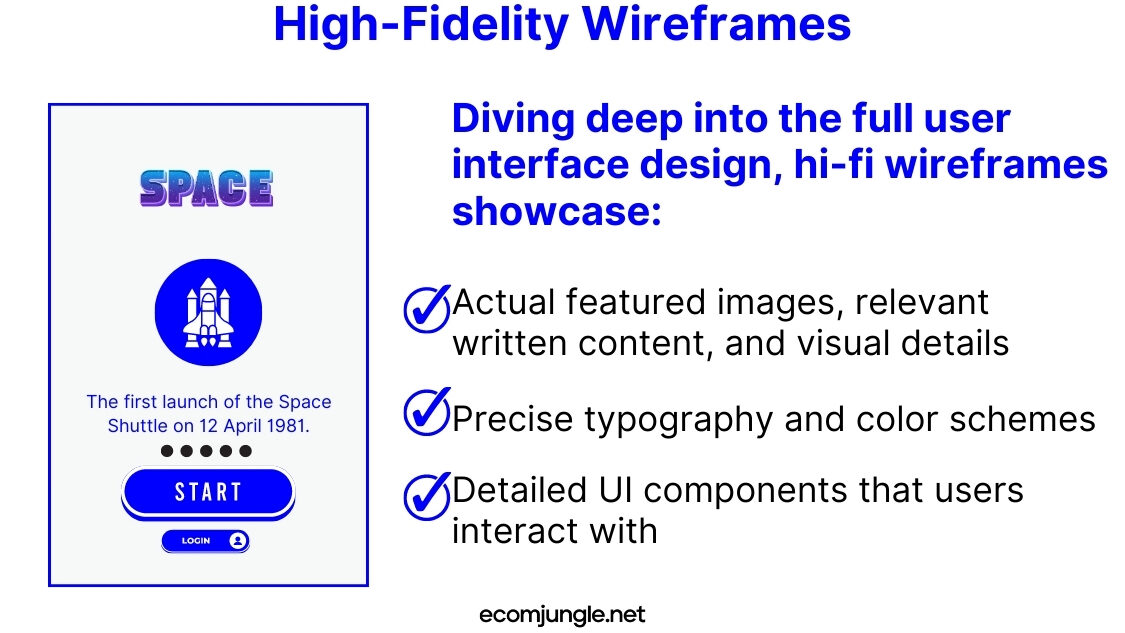
Diving deep into the full user interface design, hi-fi wireframes showcase:
- Actual featured images, relevant written content, and visual details
- Precise typography and color schemes
- Detailed UI components that users interact with
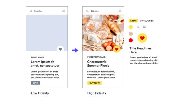
These wireframes, iterations building on the foundational details provided by mid-fidelity wireframes, intensively focus on usability and design. They include more refined renderings of each component and a meticulous focus on content layout. Elements such as copy, UI elements, hover states, and text hierarchy find their place in these wireframes.
Created digitally using wireframing tools, high-fidelity wireframes aim to provide a mirror-like reflection of the webpage or app. Their goal is to ensure that all ideas and elements from previous stages are represented in the design.
But these wireframes aren’t just static images. Many wireframing tools facilitate the creation of interactive wireframes that simulate the intended user experience flow. High-fidelity wireframes transition from mere structural blueprints to functional prototypes, ready for usability tests and for visualizing the final look and feel of the product.
High-fidelity wireframes thus embody the final checkpoint before embarking on the development stage, ensuring the design journey concludes with a product that aligns perfectly with the envisioned concept.
Takeaways
Wireframes truly are the unsung heroes of the design, development, and creative process. Their critical role in visualizing the structure, layout, and functionality of a web page or mobile app helps teams come to a consensus before moving on to the final stages of design and development. No matter their fidelity level, wireframes give us a sneak peek into the user’s journey, making them indispensable tools for UX/UI designers.
- The level of detail in a wireframe varies based on its fidelity. Low-fidelity wireframes provide a basic outline and structure, medium fidelity wireframes add a level of detail and interactivity, while high-fidelity wireframes give a detailed and interactive representation of the final product.
- Low-fidelity wireframes are perfect for the initial wireframe of your project. They are quick, great for brainstorming, and allow for swift changes and broad discussions about UI.
- Mid-fidelity wireframes bring in more clarity and specificity, making them ideal for refining the user interface elements and starting to consider user interactions.
- High-fidelity wireframes are as close to the final product as possible, providing valuable insights for usability testing and final adjustments before the development stage.
- Wireframes, irrespective of their type, are core tools in a UX/UI designer’s kit, playing an instrumental role in streamlining the design and development process.
- The choice between low, mid, and high-fidelity wireframes often depends on the project’s stage, complexity, and the need for stakeholder communication or user testing.
Conclusion
As we wrap up, let’s reflect on the unique roles played by low, mid, and high fidelity wireframes at various stages of the design process. Whether you’re crafting your own wireframes with a simple pen and paper or wielding a digital tool to finesse them, understanding these types can empower you to navigate the design process more efficiently.
Never forget, wireframing is an iterative process, and the depth of detail you plunge into will hinge on your project’s current stage and requirements. So keep on iterating, put your designs through the rigors of testing, and continue refining until you hit that sweet spot where your design addresses both user and business needs perfectly. Remember, your wireframe is the stepping stone to a great user experience. Happy designing!
Frequently Asked Questions
What are the 3 different components of a wireframe?
A wireframe is composed of three different components: information design, navigation design, and interface design.
Each plays a pivotal role in creating a user-friendly digital product. Information design organizes and structures the content, navigation design outlines the pathways users will take to navigate the product, and interface design pertains to the interactive elements and visual layout of the product.
What is UI vs UX wireframes?
User Interface (UI) and User Experience (UX) refer to distinct yet intertwined aspects of a product.
UI deals with the tangible elements that you interact with, such as screens, buttons, and icons – essentially the visual aspects of a website, app, or any electronic device. UX, conversely, encompasses the entire interaction and experience you have with the product, which includes UI but also extends to how the interaction makes you feel and its overall ease of use.
What is the difference between high and low fidelity wireframes?
The difference between high and low fidelity wireframes primarily lies in their level of detail and functionality.
A low-fidelity wireframe, often crafted with simple tools, offers a basic, skeletal illustration of a product’s layout and user paths, without intricate aesthetic features. In contrast, a high-fidelity wireframe delivers a rich, detailed, and interactive design that closely mirrors the final product. It’s created using advanced digital wireframing tools and typically incorporates actual content, color schemes, and refined UI components.